Home App

House-rental project

Details

Feels like HOME!

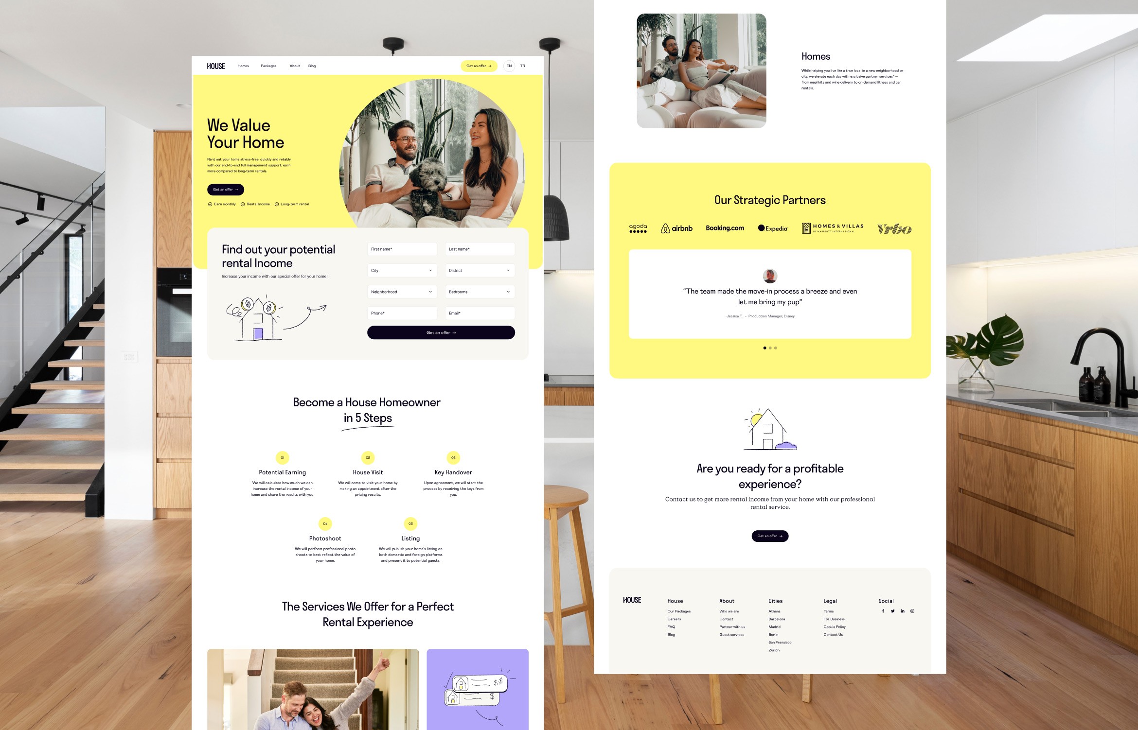
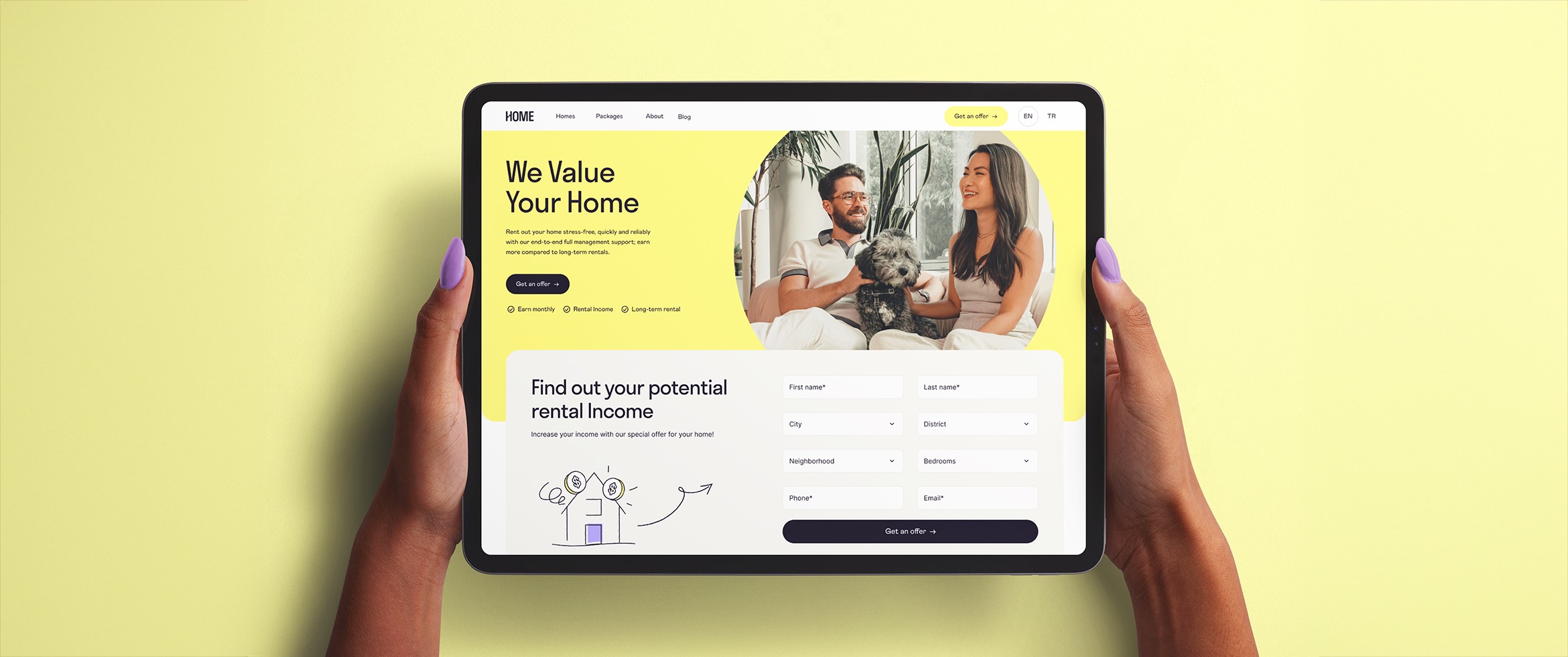
A cozy and intimate feel design for this house-rental project. Our main goal was to transform the bureaucratic process of putting a house for rental into an uncomplicated and trustworthy experience. We prioritized a straightforward UX where the user will effortlessly complete the necessary steps.

The UI focus on a friendly approach for homeowners and renters to feel welcome. The color palette has fresh spring tones to give off the feeling of friendliness and positivity.

Services

Web Design

Branding

Year

2024

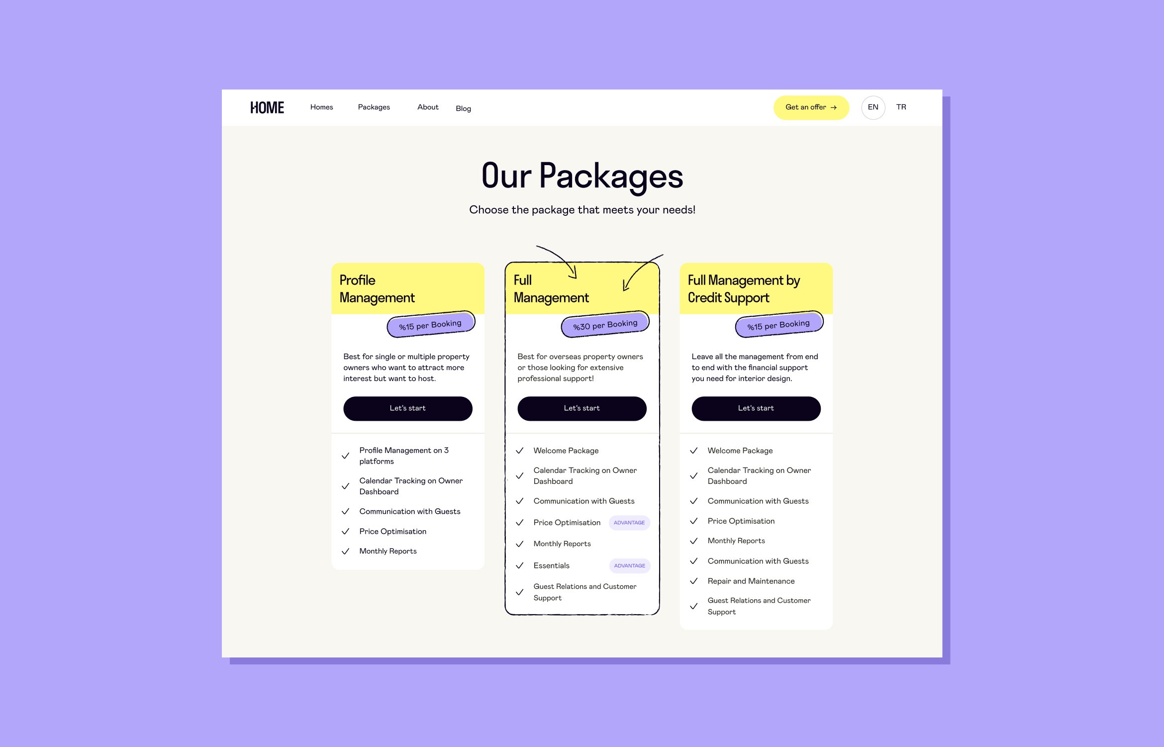
From the UX's perspective, pricing plan pages can be a complex and confusing than imagined. Users enter this page to explore what's being offered and find information about the services provided, making it an essential step of the user journey. In the HOME project, the plans have varied attributes, aiming at different audiences. We opted for creating a design that neatly presents the features, highlighting the differences between each package, so the users can understand the product and choose what fit their needs best.

From the UX's perspective, pricing plan pages can be a complex and confusing than imagined. Users enter this page to explore what's being offered and find information about the services provided, making it an essential step of the user journey. In the HOME project, the plans have varied attributes, aiming at different audiences. We opted for creating a design that neatly presents the features, highlighting the differences between each package, so the users can understand the product and choose what fit their needs best.

Credits

UX/UI Design

Nuray Derya

Thaise De Gino